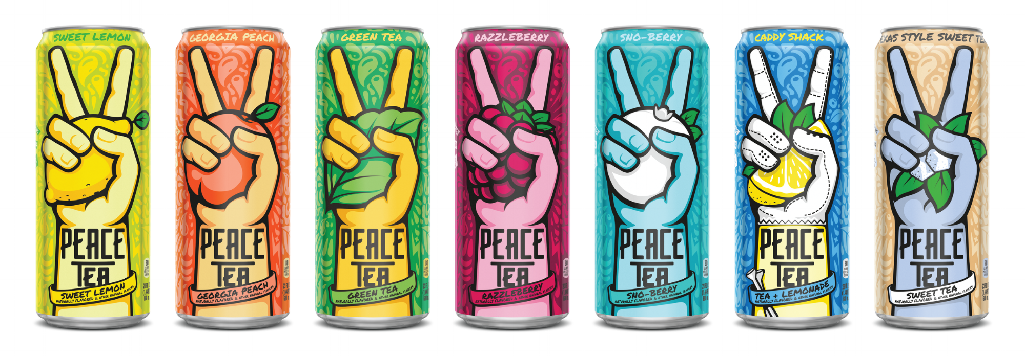

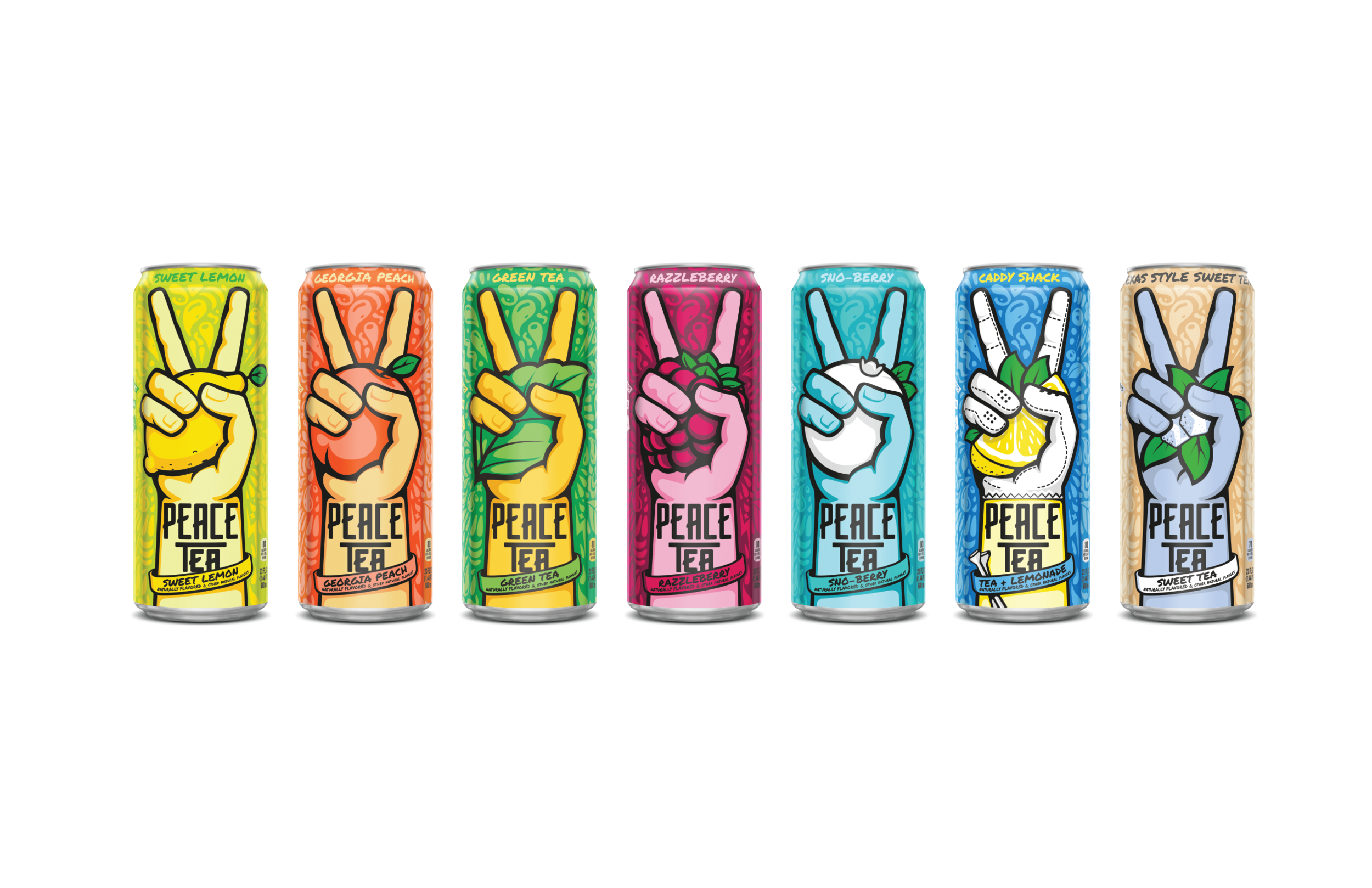
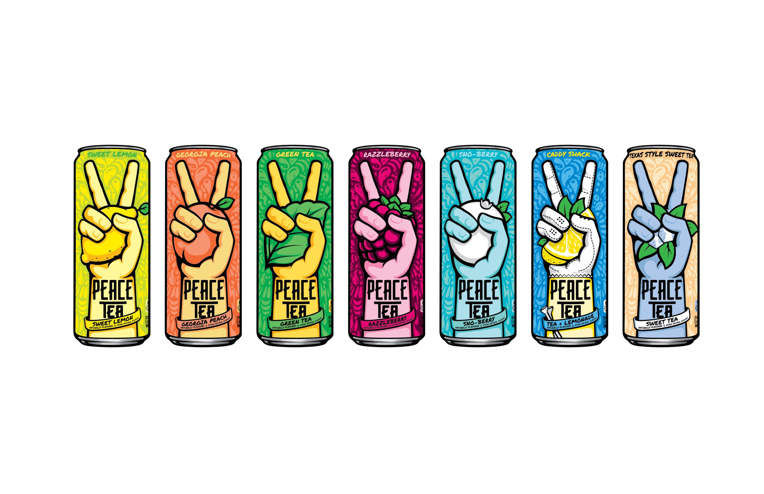
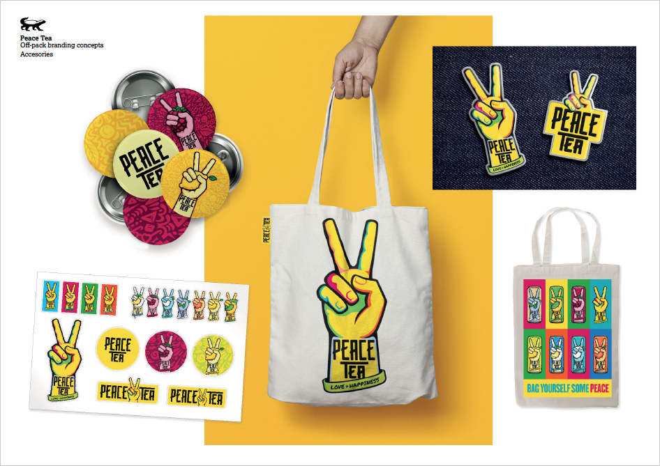
The brand team at Peace Tea came to us wanting a fresh new look for their packaging, which had used the same artwork since the brand's launch in 2009. The key objectives were to better communicate “refreshing tea flavor,” distinguish between flavors and enhance flavor cues, reinforce brand core values (Peace, Love and Happiness), all while appealing to millennials & Gen Z and establishing relevancy against the main competitor (Ahem ARIZONA).
Working with design studio Taxi based in Bristol, UK, we created a VIS that plays up flavor cues while giving a contemporary nod to the Peace Love and Happiness hippy culture that is part of Peace Tea's heritage. The new look launched in February 2017 and can be seen in stores nationwide!
Visit the new website here.
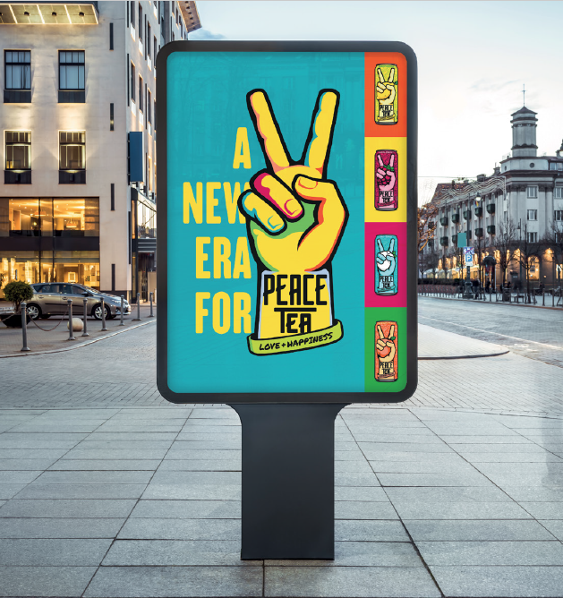
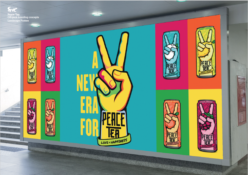
The "Peaceful Salute" is made up of all the flavor colors in the current Peace Tea portfolio to convey the bright and tasty world of the brand. It’s also a contemporary nod to the psychedelic, hippy vibes of the 60’s.